

You are using an out of date browser. It may not display this or other websites correctly.
You should upgrade or use an alternative browser.
You should upgrade or use an alternative browser.
Soloist in a PRS-style Dragon Breath stain pattern
- Thread starter docteurseb
- Start date
docteurseb
Hero Member
- Messages
- 774
First half (2nd half is on the other side and will have to wait until I get the first half clear coated):


Here are the different dyes used and mix ratios using TransTint for 1Tbsp of denatured alcohol. If using Keda dyes you'd need a lot less drops as they are far more concentrated than TransTint.
#1 Yellow: 27 drops Lemon Yellow, 2 drop Orange
#2 Orange: 40 drops orange
#3 Red: 50 drops Bright Red
#4 Dark Red: 40 Red, 6 Black
#5 Purple: 41 Blue, 7 Red, 1 Black
#6 Dark Blue: 47 Blue, 3 Black
#7 Darker Blue: 47 Blue, 6 Black
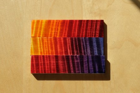
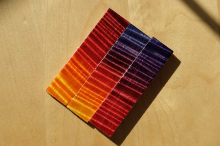
Top piece: orange to red fade with sand back:
- Fade with 2, 3, 4.
- Sandback
- Fade again, this time including the 1, 2, 3, 4.
This gives a much stronger contrast, easy to see when comparing to the middle piece.
Middle piece: Indian ocean sunset
- Fade with 1,2,3,5,7. Making sure though to overlap the purple onto the blue (so we never really have a pure blue). Also when overlapping #3 (red) with #5 (purple) the result is a darker than #5 which can look weird, to mitigate that I ended up applying so pure denatured alcohol to pull out some of the dye and brighten the color.
Bottom piece: red to purple fade
- Fade with 1, 5, and 7. Same as above I overlapped 5 completely onto 7 to shift the blue towards purple too, and I also brightened the mixed portion between #3 and #5 using denatured alcohol.
The other side actually is actually similar. I have orange to red fade but wihtout sandback, the indian ocean sunset is the same but doesn't include the bright yellow which is more like Warmoth's Nebula finish, and the red to purple fade was done using a blue I thought wasn't dark enough (#6)
Here are the different dyes used and mix ratios using TransTint for 1Tbsp of denatured alcohol. If using Keda dyes you'd need a lot less drops as they are far more concentrated than TransTint.
#1 Yellow: 27 drops Lemon Yellow, 2 drop Orange
#2 Orange: 40 drops orange
#3 Red: 50 drops Bright Red
#4 Dark Red: 40 Red, 6 Black
#5 Purple: 41 Blue, 7 Red, 1 Black
#6 Dark Blue: 47 Blue, 3 Black
#7 Darker Blue: 47 Blue, 6 Black
Top piece: orange to red fade with sand back:
- Fade with 2, 3, 4.
- Sandback
- Fade again, this time including the 1, 2, 3, 4.
This gives a much stronger contrast, easy to see when comparing to the middle piece.
Middle piece: Indian ocean sunset
- Fade with 1,2,3,5,7. Making sure though to overlap the purple onto the blue (so we never really have a pure blue). Also when overlapping #3 (red) with #5 (purple) the result is a darker than #5 which can look weird, to mitigate that I ended up applying so pure denatured alcohol to pull out some of the dye and brighten the color.
Bottom piece: red to purple fade
- Fade with 1, 5, and 7. Same as above I overlapped 5 completely onto 7 to shift the blue towards purple too, and I also brightened the mixed portion between #3 and #5 using denatured alcohol.
The other side actually is actually similar. I have orange to red fade but wihtout sandback, the indian ocean sunset is the same but doesn't include the bright yellow which is more like Warmoth's Nebula finish, and the red to purple fade was done using a blue I thought wasn't dark enough (#6)
Attachments
docteurseb
Hero Member
- Messages
- 774
For this body with natural mahogany back I'm definitely leaning towards the yellow to red fade. It's easy to fade between those colors, and it also goes well with the dragon breath pattern. My only concern is doing the sand back evenly on a curved body, it's not needed but it does improve contrast quite a bit. Also I would need to add an even darker red for the first layer prior to the sand back.
I probably overlapped colors a little too much on the red/purple piece. It should have the same blue as the middle piece but it doesn't take much to turn it purple. The red should be brighter and more vivid too. I'll redo this one to double check; I really like the color in person and will likely use it on a different body eventually.
The Indian Sunset piece is awesome but I'm having a hard time wrapping my head around where/how to lay the colors for the breath pattern. Also you can see I had to 'brighten up' the red to purple transition using alcohol; that's easy to do on a tiny flat piece but less so on a body with that fancy dye pattern.
docteurseb
Hero Member
- Messages
- 774
And the neck was just ordered: Warhead, SRV profile, 6105 SS frets, no inlays, white side dots, roasted maple with dark RW fingerboard+RW veneer.
It keeps things simple and affordable compared to the body. It also means I can stain the body soon since I won't have a maple headstock veneer.
It keeps things simple and affordable compared to the body. It also means I can stain the body soon since I won't have a maple headstock veneer.
BigSteve22
Hero Member
- Messages
- 2,798
Agreed, absolutely! That's a beautiful color, I'm so jealous........PhilHill said:I like the one in the middle. Indian Ocean Sunset, I think. But they all look great. :icon_thumright: :icon_thumright:
docteurseb
Hero Member
- Messages
- 774
You can see all three of them in the video I posted for the orange/red starting at the 2min 04s mark:
[youtube]https://youtu.be/pwpFqWOVlH4?t=124[/youtube]
Note: there are two versions of the 'Indian sunset' here. One side goes all the way to yellow while the other stops at orange. I prefer the yellow one but a happy medium could be to go orange but then pull out some of that orange dye using the yellow dye that way the denser curls would turn yellow while softer ones remain mostly orange.
Haven't gotten to make separate videos for the red/purple and Indian Ocean sunset pieces yet, but with the above done it's going to be much faster to do those.
docteurseb
Hero Member
- Messages
- 774
Re-did the dragon breath scheme on test pieces a few more times. It was really hard to tell the difference on the latest pieces between the 1 pass and 2 pass versions, thus decided it wasn't worth the trouble and complexity to attempt the 2pass version on a guitar body.
I dyed the body yesterday evening and sent it off for clear-coating today. See you in a month, and in the meantime here is the video:
[youtube]https://youtu.be/E7yOl-Wv-yM[/youtube]
I dyed the body yesterday evening and sent it off for clear-coating today. See you in a month, and in the meantime here is the video:
[youtube]https://youtu.be/E7yOl-Wv-yM[/youtube]
stratamania
Mythical Status
- Messages
- 12,402
When I was watching the video of the dye process I could not help thinking of a dyeing V. It does look very good so I look forward to seeing it progress further.
docteurseb
Hero Member
- Messages
- 774
Thanks!
I was surprised by the chatoyance of the top, it's insane.
You can of course get a sense of it on the first few pictures of the wet body at the beginning of the video; but it's also very noticeable during the 'flyover' even though the body was dry at that point.
I'm debating the HW color choice. I have chrome because it was supposed to be the green version (laguna) of the dragon breath scheme.
Now that it's red/orange/yellow some black or cosmo black HW could look better. There's gold too but I avoid that whenever possible.
ragamuffin
Hero Member
- Messages
- 1,704
It's very cool to see the stain application, it turned out great!
docteurseb
Hero Member
- Messages
- 774
docteurseb
Hero Member
- Messages
- 774
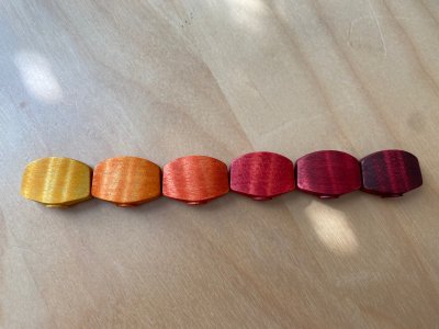
Only problem is that for inline tuners these buttons are a bit large, there'll only be about a 2mm gap between them.
Visually that may look a little cramped. Functionally that may hopefully not make much of a difference.
Visually that may look a little cramped. Functionally that may hopefully not make much of a difference.
rgand
Epic Member
- Messages
- 5,934
Those are looking great! What a fine addition.docteurseb said:Only problem is that for inline tuners these buttons are a bit large, there'll only be about a 2mm gap between them.
Visually that may look a little cramped. Functionally that may hopefully not make much of a difference.
Have you considered narrowing them a bit before applying the stain? Obviously, not on this set now but on future ones you could do that to increase the space between them.
Similar threads
- Replies
- 12
- Views
- 386
- Replies
- 17
- Views
- 1K