

You are using an out of date browser. It may not display this or other websites correctly.
You should upgrade or use an alternative browser.
You should upgrade or use an alternative browser.
AquaMaster Build
- Thread starter Cactus Jack
- Start date
stratamania
Mythical Status
- Messages
- 12,390
It will be interesting to see further progress in your quest of chatoyance.
Cactus Jack
Senior Member
- Messages
- 484
stratamania said:It will be interesting to see further progress in your quest of chatoyance.
Your Strats look stunning. Do they have chatoyance, or are they a bit flat too? I think I read you purchased them through the Showcase, is that correct? For my next go around I'm going to stick with Showcase items that I can see.
Regarding chatoyance, I thought it was a base quality of all figured woods. Maybe it's more prominent in flame tops vs quilt, but all of my guitars exhibit it to some degree. Some are phenomenal, some are OK, but in all cases, it's there. Honestly, my daughter's guitar has a paper-thin veneer, maybe 1mm thick, but the streaks of flame have impressive depth and movement. I took a chance, it didn't work, on to the next one.
stratamania
Mythical Status
- Messages
- 12,390
Thanks for your feedback.
The purple one certainly it does. It is more or less so depending on the lighting, for example, the shot below was in strong sunlight. In artificial light, it looks darker but still looks fine to me. It possibly is not as prominent as the finer flame maple on my Gibson Les Paul which is cherry burst but that, of course, has a carved top which helps the light and impression of depth.
I tend to think chatoyance depth will be more prominent when lighter colours are used or possibly blacks. With purples and blues being more at the cool end of a colour spectrum it may well be a piece of nicely grained wood will display less depth than with a lighter green, yellow or reds. It is probably also about the contrast in colours. Often on died finishes, a dark dye is applied and sanded back when dry to then have a lighter dye applied over the top to enhance the grain pattern. Although all of that said, wood being wood until a finish is done it probably is not possible to predict 100% the result.
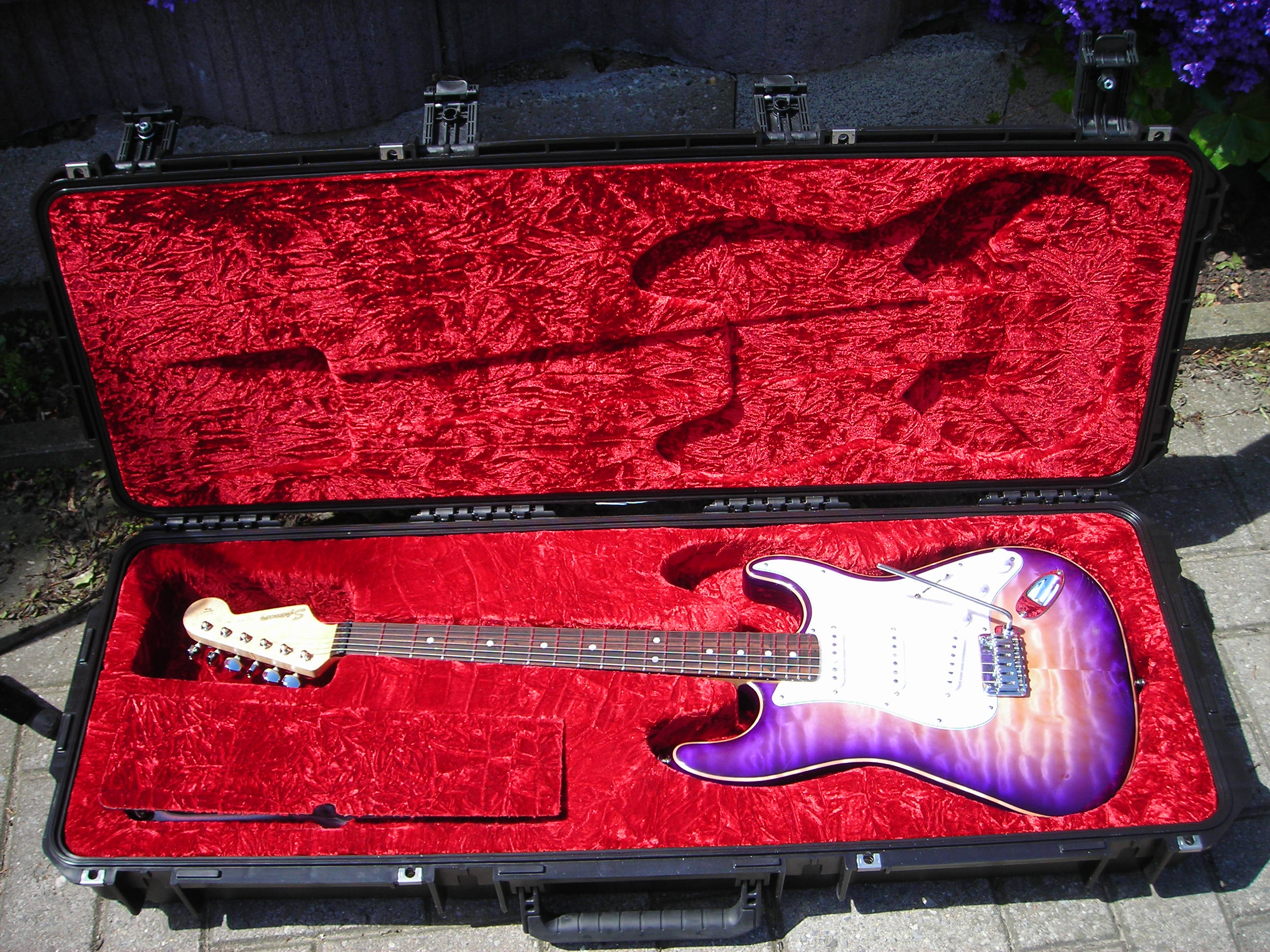 Case_1 by stratamania, on Flickr
The purple one certainly it does. It is more or less so depending on the lighting, for example, the shot below was in strong sunlight. In artificial light, it looks darker but still looks fine to me. It possibly is not as prominent as the finer flame maple on my Gibson Les Paul which is cherry burst but that, of course, has a carved top which helps the light and impression of depth.
I tend to think chatoyance depth will be more prominent when lighter colours are used or possibly blacks. With purples and blues being more at the cool end of a colour spectrum it may well be a piece of nicely grained wood will display less depth than with a lighter green, yellow or reds. It is probably also about the contrast in colours. Often on died finishes, a dark dye is applied and sanded back when dry to then have a lighter dye applied over the top to enhance the grain pattern. Although all of that said, wood being wood until a finish is done it probably is not possible to predict 100% the result.
Case_1 by stratamania, on FlickrCactus Jack
Senior Member
- Messages
- 484
OMG! That guitar is PHENOMENAL...WOW.
Having spent hours working on frets I immediately (after the smoking body) noticed how stunning yours are. Talk about mirror-like finish...look at the reflection of the case liner. Beyond impressive. Simply amazing. You just raised my expectation bar for future Warmoth builds") .
.
Having spent hours working on frets I immediately (after the smoking body) noticed how stunning yours are. Talk about mirror-like finish...look at the reflection of the case liner. Beyond impressive. Simply amazing. You just raised my expectation bar for future Warmoth builds
. stratamania
Mythical Status
- Messages
- 12,390
Cactus Jack said:OMG! That guitar is PHENOMENAL...WOW.
Having spent hours working on frets I immediately (after the smoking body) noticed how stunning yours are. Talk about mirror-like finish...look at the reflection of the case liner. Beyond impressive. Simply amazing. You just raised my expectation bar for future Warmoth builds
Thanks very much for your feedback and I do appreciate it. The purple one was the first one I did a few years ago. The link to the build thread for it is in my signature if you wanted to see more of that early adventure.
Cactus Jack
Senior Member
- Messages
- 484
Guys, we can officially close this thread. I have a new body on the way...expect a new build thread soon. Think this one is gonna be special.
BigSteve22
Hero Member
- Messages
- 2,798
Looking forward to seeing it come together.Cactus Jack said:Think this one is gonna be special.
Cagey
Mythical Status
- Messages
- 24,425
Cactus Jack said:Regarding chatoyance, I thought it was a base quality of all figured woods.
No. It usually is, but the degree varies as much as the figuring does. I've seen some so dramatic they look like optical illusions, and others that seem 2-dimensional.
rgand
Epic Member
- Messages
- 5,934
I'm looking forward to that! :icon_thumright:Cactus Jack said:Guys, we can officially close this thread. I have a new body on the way...expect a new build thread soon. Think this one is gonna be special.
Cactus Jack
Senior Member
- Messages
- 484
I just saw the body I returned is now in the Showcase. I'm calling Photoshop shenanigans. The guitar, in my hands, looks nothing like what is shown on the website. Obviously Warmoth has professional lighting, cameras, and software, but this just isn't representative of the body I physically inspected. In reality, there was little to no Teal, the color was much darker overall, and the quilt exhibited little to no depth. Maybe you guys see something different, but I'm telling you, the guitar looked very different in person. Had it looked like the showcase, it would still be mine.
Here's the Showcase:

Here's reality:

Even the Candy Blue looks amplified:
Showcase:

Reality:

Here's the Showcase:
Here's reality:
Even the Candy Blue looks amplified:
Showcase:
Reality:
Axkoa
Hero Member
- Messages
- 858
I'd say probably because you haven't got a professional camera setup like Warmoth does. The lighting in your photo looks really warm, yellow, and dark compared to what Warmoth would use to take photos. The four photos look pretty close to me, just that your lighting isn't ideal.
Megatron
Junior Member
- Messages
- 94
Definitely looks like a white balance issue. TBH your pics and the showcase ones look identical to me. I've got a Gibson LP that looks like a plain top from most angles at night, but in the day, you can see the flames very well. Did you ever check out that body in the sunlight? I don't doubt that it was missing that 3D effect, but the 2D pics do look quite similar.
Cactus Jack
Senior Member
- Messages
- 484
For all the reasons folks have mentioned comparing pics is a losing proposition. Too many different variables make it an unfair comparison. However, having held the body in my own hands, reviewing it in various light conditions, it never looked like the Showcase pic. There was so little Teal I almost thought it was Blue Burst instead of Aquamarine. The colors ranged from mild blue to dark blue. I'm getting older so maybe my eyes are going a bit, but needless to say I was fairly shocked to see how different the body looks in the Showcase compared to my hands.
Ace Flibble
Hero Member
- Messages
- 865
Just to throw in (found this while searching for real world examples of Candy Blue), I have found without exception that the photos Warmoth puts up are not all that representative of reality when it comes to any transparent colour or dye. They definitely do punch it up in editing.
And before someone says "oh but they have a professional set up, that's why it looks better", I am a professional photographer myself, specifically I do high-end product and archive work with items many, many times more valuable than any Warmoth part. Suffice to say I know every variable and know how these things should be shot for accuracy, and what Warmoth throws up there definitely is not in any way accurate. At least when it comes to transparent and dye tops, anyway. They don't 'juice' solid colours as much, but they do punch up the contrast on metallic/pearlescent/candy/bodies and whoever is doing their photos is hammering up the clarity slider on all shots of dye tops. (Hence exactly why I was searching for real-world shots of Candy Blue and Spectra Blue before ordering either. Side note, how rare is Spectra Blue?!)
Now whether they are doing it on purpose or not, I can't say. I do believe in blaming ignorance or accident before malice. An unfortunately increasing proportion of photographers these days do not use calibrated colour profiles nor calibrated monitors, and edit by eye with the mentality "most viewers are looking on uncalibrated phone screens anyway, so screw it". Similarly there are lots of working photographers out there who never consider to check the colour temperature of their lights or consider how different types of lighting will interact with the countless microscopic layers of dyed wood and gloss paint. There are also lots of product shooters who use extremely inappropriate equipment because YouTube told them a particular lens was the sharpest or the camera has the most dynamic range, not considering that colour and tonal reproduction might be more important. Of course in the same vein some photographers thoughtlessly apply inappropriate processing presets and filters because those too have been sold to them as a one-click shortcut to better results, accuracy be damned.
So I'll refrain from saying Warmoth are out-and-out trying to trick people, but they very certainly, at the absolute least, are using inaccurate photos (however it is they might end up with that result) and I do not blame any customer for being disappointed with any particular wood figuring or finish. If I handed in photos which were as inaccurate as Warmoth's, my clients would demand I reshoot at my own expense and they'd likely never hire me ever again.
(Funnily enough I much prefer that photo of Candy Blue than Warmoth's cheesy primary poster paint shade, though I can tell that photo isn't wholly accurate, either. Good luck with the new body, anyway.)
Kostas
Hero Member
- Messages
- 1,384
Cactus Jack said:...Below are two examples of Warmoth quilt tops. I know which one I hope I get!


In these two photos you can see how wisely they chose which to top & rear rout. Although they do it, it's a shame when they top rout heavily quilt tops.
Cactus Jack said:...I admit I'm hard to please..
...Third, and final point is value. Yes, I did not opt for a "choose your own" top, but no, I was not expecting AAAA. I spoke with Warmoth several times before I placed my order. Customer service was very clear that AAAA quality was reserved for CYO and Showcase items. They were also clear that the builders grab what's in stock, do their best to book match etc, but they don't hand-select the material. They are running a business and can't stop to hand-select materials for every build. I fully understand and appreciate all aspects of their business. However, all in this is a $700+ custom order. In my opinion, based on the totality of the product, I don't feel I received $700+ in value. Simple as that. Nothing bad about Warmoth, they are a class act, but for the reasons outlined above I'm struggling to love my purchase.
Years ago when I made my Warmoth guitars I was also picky that's why I only bought showcase bodies and I can say they look better in person than in the photos. I wish I could feel again like the first time I opened each box.
10+ years ago they were more willing to hand select materials, I had showed them several photos as examples of what I wanted and the results matched. In 2014 when I ordered my last neck I had a mild dissapointment. It was good but not as good as I expected for a $700 neck. Don't know how others view it but a neck of that price it's a really expensive neck.
Wolff05
Senior Member
- Messages
- 224
Ace Flibble said:Just to throw in (found this while searching for real world examples of Candy Blue), I have found without exception that the photos Warmoth puts up are not all that representative of reality when it comes to any transparent colour or dye. They definitely do punch it up in editing.
And before someone says "oh but they have a professional set up, that's why it looks better", I am a professional photographer myself, specifically I do high-end product and archive work with items many, many times more valuable than any Warmoth part. Suffice to say I know every variable and know how these things should be shot for accuracy, and what Warmoth throws up there definitely is not in any way accurate. At least when it comes to transparent and dye tops, anyway. They don't 'juice' solid colours as much, but they do punch up the contrast on metallic/pearlescent/candy/bodies and whoever is doing their photos is hammering up the clarity slider on all shots of dye tops. (Hence exactly why I was searching for real-world shots of Candy Blue and Spectra Blue before ordering either. Side note, how rare is Spectra Blue?!)
Now whether they are doing it on purpose or not, I can't say. I do believe in blaming ignorance or accident before malice. An unfortunately increasing proportion of photographers these days do not use calibrated colour profiles nor calibrated monitors, and edit by eye with the mentality "most viewers are looking on uncalibrated phone screens anyway, so screw it". Similarly there are lots of working photographers out there who never consider to check the colour temperature of their lights or consider how different types of lighting will interact with the countless microscopic layers of dyed wood and gloss paint. There are also lots of product shooters who use extremely inappropriate equipment because YouTube told them a particular lens was the sharpest or the camera has the most dynamic range, not considering that colour and tonal reproduction might be more important. Of course in the same vein some photographers thoughtlessly apply inappropriate processing presets and filters because those too have been sold to them as a one-click shortcut to better results, accuracy be damned.
So I'll refrain from saying Warmoth are out-and-out trying to trick people, but they very certainly, at the absolute least, are using inaccurate photos (however it is they might end up with that result) and I do not blame any customer for being disappointed with any particular wood figuring or finish. If I handed in photos which were as inaccurate as Warmoth's, my clients would demand I reshoot at my own expense and they'd likely never hire me ever again.
(Funnily enough I much prefer that photo of Candy Blue than Warmoth's cheesy primary poster paint shade, though I can tell that photo isn't wholly accurate, either. Good luck with the new body, anyway.)
I can personally guarantee you all that no showcase images are "juiced up". There would be no point in doing this, because... returns. Around 100 unique items move through the photography department each day, which means at least 200 unique images are shot and edited DAILY (by one amazing person). Minimal editing is done (yes in a calibrated color space), mostly to replace the background for consistency. No figured tops are "enhanced", they just look that good. As someone that physically has handled the entire showcase and compared each item to the image represented, you have my guarantee on that. :icon_thumright: Of any photo type, cell phone photos are going to be the least accurate. (Lighting isn't consistent, and white balance is non-existent.)
Since Warmoth's photos are consistent (head on shot), dynamic colors or figuring such as candy, flake, flame, or quilt, do not turn out so great. Often an angled shot will be added to help capture the chatoyance that doesn't show in a straight-on shot. But that just means it looks even better in person than in the picture. From what I see (here on UW and from minimal returns) most people have their expectations surpassed when their item arrives, and only a handful have been disappointed.
What say all of you? :bass:
Cagey
Mythical Status
- Messages
- 24,425
I've been consistently and pleasantly surprised every time I open a package from Warmoth. The product always looks better in real life than in the photos. Not that the photos aren't good - they are - but some things just aren't translatable to 2D. The chatoyance of the deep curl or quilt of figured woods depends heavily on stereoscopic vision, which normal cameras and monitors just don't have or present. You can angle, light, or otherwise augment the subject until the cows come home, but it just ain't happening. Depth requires two angles of light entering the brain simultaneously from two sources so it can "calculate" the distance or sense depth.
Wolff05
Senior Member
- Messages
- 224
Cagey said:I've been consistently and pleasantly surprised every time I open a package from Warmoth. The product always looks better in real life than in the photos. Not that the photos aren't good - they are - but some things just aren't translatable to 2D. The chatoyance of the deep curl or quilt of figured woods depends heavily on stereoscopic vision, which normal cameras and monitors just don't have or present. You can angle, light, or otherwise augment the subject until the cows come home, but it just ain't happening. Depth requires two angles of light entering the brain simultaneously from two sources so it can "calculate" the distance or sense depth.
Perfectly said Cagey. Always appreciate your posts.
Similar threads
- Replies
- 12
- Views
- 346