There is no single international standard (like an ISO or IEEE spec) that rigidly defines "pastel."
However, in color theory and digital color spaces, a pastel is technically defined by specific ranges within the HSV (Hue, Saturation, Value) or HSL (Hue, Saturation, Lightness) color models.
Technically, a pastel is a Tint. This means it is a pure hue mixed with a significant amount of white.
Here is the technical breakdown of what constitutes a pastel color.
1. The HSL Specification (The Most Accurate Metric)
The HSL model is the standard way to define pastels programmatically because it separates "Lightness" from the color itself. To be technically classified as pastel, a color usually falls within these ranges:
* Hue: Any (0 degrees to 360 degrees)
* Saturation: Low to Medium (15% to 50%)
* Lightness: High (70% to 95%)
The Logic:
* If Lightness is too low (< 70%), the color becomes "muddy" or "muted" rather than pastel.
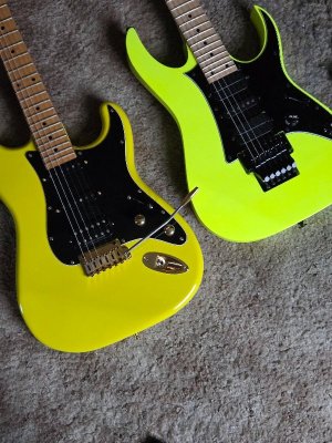
* If Saturation is too high (> 60%) while Lightness is high, the color becomes "neon" or "fluorescent."
2. The HSV/HSB Specification
In the Hue, Saturation, Value model, the definition shifts slightly but relies on the same principle of high brightness.
* Saturation: Low (0.1 to 0.4 or 10–40%)
* Value (Brightness): Very High (0.8 to 1.0 or 80–100%)
3. The RGB Mathematical Representation
In the RGB (Red, Green, Blue) space, pastels are defined by low contrast between channels and high integer values.
Mathematically, this looks like:
* High Values: All three channels (R, G, B) are closer to 255 than to 0.
* Dominance: The dominant channel determines the Hue, but the non-dominant channels must be high enough to "wash out" the intensity.
For example, a pure intense Red is (255, 0, 0).
A Pastel Red (Pink) adds high levels of Green and Blue to move closer to White: (255, 180, 180).
Summary
If you are writing a script or validating a color palette, a color is technically pastel if:
* It is NOT grayscale (Saturation > 0).
* The sum of RGB values is high (usually > 600 total).
* In HSL, the Lightness is > 0.75 and Saturation is < 0.5.


