GAS Alert!!!!

Slobber... "And I would have gotten away with it bought it too if it weren't for you meddling cream facedots!"

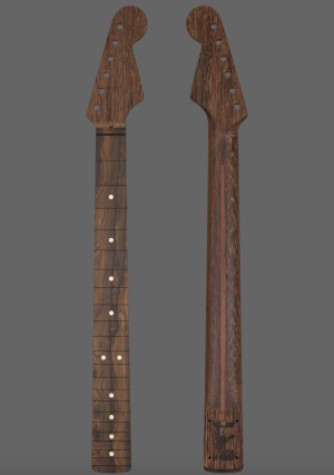
Anyone else think that the cream dots look hideous/cheap on anything other than a very vintage-y maple/rosewood neck?  :dontknow:
 

Attachments

  • Screen Shot 2019-09-26 at 11.03.43 AM.png
    Screen Shot 2019-09-26 at 11.03.43 AM.png
    850.4 KB · Views: 257
A couple nice necks, there.

Ian, that one looks like it's a Gibson conversion. Nice.

ragamuffin, I like the clay dots but they generally don't match anything I put together. I like to see ones that don't contrast quite as much.
 
Okay, see there's this flame maple top, see... and it's unlike anything i've seen before, see...  and i'm thinking a mooncaster with a mahogany back and black binding done in clear, see...  or maybe brown burst, see...

LT2658a.jpg


can you see?
 
Well, the upper half of that piece has a lighter contrasting streak that amber or vintage tint would soften, if that's your goal (bearing in mind that once you actually glue it to a blank and rout it for pickups most of that streak will be obliterated anyway).    My own sentiments lean toward ivoroid binding and a tobacco burst with a very narrow burst edge, but it ain't my guitar we're talking about here.
 
Bagman67 said:
Well, the upper half of that piece has a lighter contrasting streak that amber or vintage tint would soften, if that's your goal (bearing in mind that once you actually glue it to a blank and rout it for pickups most of that streak will be obliterated anyway).    My own sentiments lean toward ivoroid binding and a tobacco burst with a very narrow burst edge, but it ain't my guitar we're talking about here.

That's a good suggestion baggy.
 
ghotiphry said:
what about amber dye or vintage tint?
Vintage tint, that was my first thought too. I'm really liking the way it looks on the flame maple on my CasinoCaster. But then again, I also really like the clear on my flame top Jazzmaster. Decisions, decisions.... Either way, considering the beauty of that top, I'd want to keep as much of it visible as possible. My suggestion is to trust your own sense of aesthetics, they've been spot on so far!
 
Thanks for the responses (and encouragement) you guys.  But I've given this a day of thought and it comes up to close to what I already have.  Besides, I already have another on the drawing board.  I'm just short on cash right now.

yAVmYu1.jpg
 
alpine all the way baby.  ghost white is where it's at.

additionally, to get a solid finish on these mooncasters, you have to choose a mahogany top.  i'm not sure i want mary kaye over mahogany.  i've got no idea how that looks.  i'm thinking it's likely more pinkish than i want.
 
Yeah, I expect you're right that mahogany would be a poor choice for MKW. That being the case, alpine white will really look good.
 
Cagey, thanks for posting.  You've reminded me I always liked your ice blue tele...  Hmmm...

Oh by the way, there's a broken image in your signature.
 
Yeah, the L5s is hosted on my a server which appears to be balking at links, and I don't know why. I need to call them, but it's always a long, involved call that eats my life so I've been putting it off.
 
Back
Top