
You are using an out of date browser. It may not display this or other websites correctly.
You should upgrade or use an alternative browser.
You should upgrade or use an alternative browser.
Kustom Kraft 1830 Tribute Guitar
- Thread starter B3Guy
- Start date
DangerousR6
Mythical Status
- Messages
- 15,478
That's got 1960's all over it...
Fat Pete
Hero Member
- Messages
- 1,657
I don't think it would be too much at all. As the rest of the body is also quite light-coloured, it wouldn't be a very strong contrast, just an incredibly cool one. Do it!B3Guy said:Should the center section be gorilla vanilla too, or would that be too much?
BigSteve22
Hero Member
- Messages
- 2,798
DangerousR6 said:That's got 1960's all over it...
I couldn't agree more. Very cool!
B3Guy
Hero Member
- Messages
- 1,262
https://flic.kr/p/KAbRDH
The aluminum frame of the bigsby was aged by scuffing it a little with a Scotch Brite pad, wrapping it in tissues and soaking those with stove cleaner. The stove cleaner tarnishes the aluminum and gives it that darker look, and the tissues hold the cleaner directly on the metal's surface, preventing evaporation.
For nickel, I found that all the harsh acid fume/acid dip suggestions are totally hogwash, unless you want a genuine rust bucket of a guitar. Regular old vinegar fumes work great, and at a more controllable pace.
Chrome is another matter. It doesn't react to anything! Whenever you see pitted or otherwise aged chrome, what you're really seeing is spots where the chrome plating has been breached, and the underlying metal has succumbed to the elements.
Considering that the chrome pickups on this puppy are ACTUAL 1960s genuine articles, and they're as-new shiny (save some micro-scratches), The other chrome on the guitar will get the same treatment: light scratches, and perhaps a couple dings from hard knocks, but no chemical treatment.
Verne Bunsen
Hero Member
- Messages
- 2,524
I don't know how I've missed this thread up till now, but this guitar is frickin' killer! The vanilla center section clinches it, it's a perfect contrast with the body yet ties it up seamlessly with the headstock. Absolutely one of the coolest things I've seen around here, and that is truly saying something!
B3Guy
Hero Member
- Messages
- 1,262
Thanks! This guitar has been a much-needed exercise in design, both form and function. I work in a creative field (video production), but I've found that it's really important to take on projects outside my professional area of expertise.
Proportion, color, pattern, style. These universal visual considerations can quickly become old-hat through repetition (say, looking through the lens of a camera day after day). Switching up the exercise (designing a guitar) provides the 'ol brain-muscle a fresh workout routine.
I watched a panel discussion recently on design for the new Star Wars films, TFA and Rogue One. One striking similarity to my work on this guitar is that "design happens within a box". Design for Star Wars must first and foremost LOOK like Star Wars. This may sound trivial, but that is where the true talent in design lies: in successfully negotiating between the box and your creativity, to end up with something that disrespects neither.
So: "a guitar must LOOK like a guitar" is the logical translation . . . kinda. When you say "this has 1960 written all over it", you may be thinking "well it's obvious that B3Guy designed his guitar that way". Not exactly. Countless guitar designers back in the day designed theirs that way. In my case, "1960" is the box.
It's REALLY awesome to get feedback from you all that affirms my efforts have been successful!
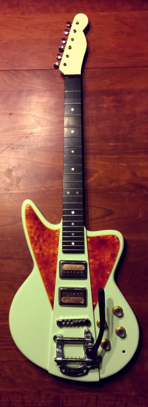
An example: the raised center section. Am I the first to incorporate this element? No. It's associated mainly with the Firebird. On that classic body, it has potential as a graphic element. I like strong graphic elements, so as an acceptable option within the "1960" box, I took the raised center section and strengthened it, making it my own. It's a taller section, in a different color, and it flares, adding a sense of movement or energy. It becomes more intensely graphic in nature only by using it to split the contrasting pickguard. (Tortoiseshell also being both a "1960" choice and a strong visual).
The body is the same thickness as the original Kustom-Craft, and is very similar in shape. Here again the box was balanced against the creative... It had to be bigger to fit a Bigsby.
Perhaps the only element of contention is the somewhat unfortunate headstock shape. It was an inexpensive used neck with the right neck back profile and scale length to match the original Kustom-Craft, so I went with it. The original headstock was a giant off-brand-bland version of a Stratocaster headstock, so I suppose the Fender Telecaster look isn't too far afield. To my eyes, it is too close to a well-known, name-brand guitar element, but the painted headstock departs it a little bit.
There are a couple more features that push against the box, but those are Top Secret until full completion of the guitar. Let's just say it's something in the "never been done" category. :icon_thumright:
Proportion, color, pattern, style. These universal visual considerations can quickly become old-hat through repetition (say, looking through the lens of a camera day after day). Switching up the exercise (designing a guitar) provides the 'ol brain-muscle a fresh workout routine.
I watched a panel discussion recently on design for the new Star Wars films, TFA and Rogue One. One striking similarity to my work on this guitar is that "design happens within a box". Design for Star Wars must first and foremost LOOK like Star Wars. This may sound trivial, but that is where the true talent in design lies: in successfully negotiating between the box and your creativity, to end up with something that disrespects neither.
So: "a guitar must LOOK like a guitar" is the logical translation . . . kinda. When you say "this has 1960 written all over it", you may be thinking "well it's obvious that B3Guy designed his guitar that way". Not exactly. Countless guitar designers back in the day designed theirs that way. In my case, "1960" is the box.
It's REALLY awesome to get feedback from you all that affirms my efforts have been successful!
An example: the raised center section. Am I the first to incorporate this element? No. It's associated mainly with the Firebird. On that classic body, it has potential as a graphic element. I like strong graphic elements, so as an acceptable option within the "1960" box, I took the raised center section and strengthened it, making it my own. It's a taller section, in a different color, and it flares, adding a sense of movement or energy. It becomes more intensely graphic in nature only by using it to split the contrasting pickguard. (Tortoiseshell also being both a "1960" choice and a strong visual).
The body is the same thickness as the original Kustom-Craft, and is very similar in shape. Here again the box was balanced against the creative... It had to be bigger to fit a Bigsby.
Perhaps the only element of contention is the somewhat unfortunate headstock shape. It was an inexpensive used neck with the right neck back profile and scale length to match the original Kustom-Craft, so I went with it. The original headstock was a giant off-brand-bland version of a Stratocaster headstock, so I suppose the Fender Telecaster look isn't too far afield. To my eyes, it is too close to a well-known, name-brand guitar element, but the painted headstock departs it a little bit.
There are a couple more features that push against the box, but those are Top Secret until full completion of the guitar. Let's just say it's something in the "never been done" category. :icon_thumright:
Similar threads
- Replies
- 49
- Views
- 3K