Dyeing flame maple not working

Messages
14
I'm trying to dye flame maple and I'm not getting the classic flame effect that I'm aiming for.

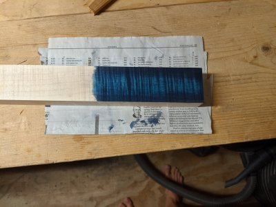
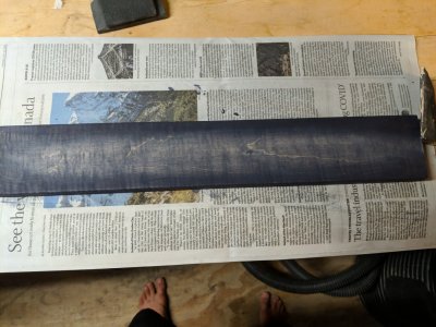
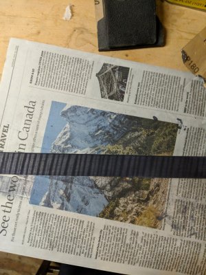
I'm using Keda dyes. I sanded the wood to 150 grit, per the Keda dye instructions. I've mixed a black dye (more like a deep purple because I polluted it with a little blue) and a blue dye. My process is to apply 2 coats of black dye, sand back a burst shape, then apply blue dye. I want blue with black stripes fading into black.

My test piece turned out fantastic. I am now trying to do it on the real piece, but the curl and the rest of the wood are absorbing the dye equally. When I sand back the dye is fading from the wood uniformly, rather than staying in the curl.

The sides of the piece are absorbing the dye exactly as expected. But the front is not.

The test piece currently has 1 layer of shellac on it to make it look less dull.

I'll attach more photos in a minute
 
Here are the test piece, the piece I'm working on, and the side of the piece I'm working on.
 

Attachments

  • PXL_20210817_151202675.jpg
    PXL_20210817_151202675.jpg
    2.5 MB · Views: 185
  • IMG_20210817_201009.jpg
    IMG_20210817_201009.jpg
    1.2 MB · Views: 163
  • IMG_20210817_201005.jpg
    IMG_20210817_201005.jpg
    1.1 MB · Views: 145
You might find if you dye the side of your test piece it may be similar to the face of the other piece. It is more likely not the dye it is the grain orientation etc of the different boards. And of course no piece of wood is the same as another.
 
A couple ideas, keda does make a black, try using that rather than mixing 2 colors?

Try mixing in isopropanol instead of water.

Look for a carbon black and try using that with a suitable solvent, carbon black will be a suspension, not a solution, might be easier to get differential penetration that way.

And try non-aqueous dyes, again nonpolar solvents would have different penetration characteristics.
 
Actually the first and third photos look pretty good, and remember when you put a finish on it, that helps make it pop.
 
rick2 said:
Actually the first and third photos look pretty good, and remember when you put a finish on it, that helps make it pop.


The first photo is the test piece and the third photo is the side of the board. I want the second photo to look like the other 2.
 
now i'm no wood expert (wooxpert) but here are some thoughts: ur test piece looks quartersawn and ur second photo (main attempt) is clearly very flat sawn and has less figure. perhaps dyes just doesn't 'zorb (short for absorb) the same in those scenarios.  The last photo looks gud cuz when you turn flat sawn sideways ur basically looking at quartersawn grains. i don't thonk you'll really be able to make the 2nd one look like the others becuz of the nature of nature. Sry, friend
 
Sadie-f said:
A couple ideas, keda does make a black, try using that rather than mixing 2 colors?

Try mixing in isopropanol instead of water.

Look for a carbon black and try using that with a suitable solvent, carbon black will be a suspension, not a solution, might be easier to get differential penetration that way.

And try non-aqueous dyes, again nonpolar solvents would have different penetration characteristics.

A question & another suggestion.

What grit paper are you using to sand back? You're trying to see s differential effect, and if the difference exists across a thinner section as your workpiece, then technique may need to be changed.
 
Thanks for the suggestions everyone. I sanded most of the dye off and started over using thinner dye. I didn't get exactly the effect I wanted, but I did get the stripes to be a little darker than the rest. I'm happy enough with how it looks now and have started finishing it with shellac. The shellac will make the curl pop regardless; I just won't have quite the contrasting colors that I wanted.
 
Toolmaster Of Brainerd said:
Thanks for the suggestions everyone. I sanded most of the dye off and started over using thinner dye. I didn't get exactly the effect I wanted, but I did get the stripes to be a little darker than the rest. I'm happy enough with how it looks now and have started finishing it with shellac. The shellac will make the curl pop regardless; I just won't have quite the contrasting colors that I wanted.

What you're seeing between the face and sides is expected.
In your case the face of the piece is mostly flat sawn while the sides are quartersawn which tends (from experience) to absorb dyes immensely better.

You will not be able to achieve a super high contrast figure with the face of this piece no matter how hard you try.
I have similar pieces of curly maple and cut them in slices to make truss rod covers specifically for that reason.

The other aspect is indeed dye concentration, to maximize the contrast you would want a nearly undiluted black dye, raise the grain with water, sandback, and then apply a blue that's not as dark.

Did you raise the grain with water before sanding back ? While you can get away without raising it if using the 1/4 sawn sides of the piece, the face of it would likely greatly benefit from it.

 
Back
Top