Blue Quilt Top Royale!!!

BranCaster

Newbie
Messages
12
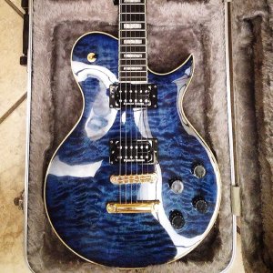
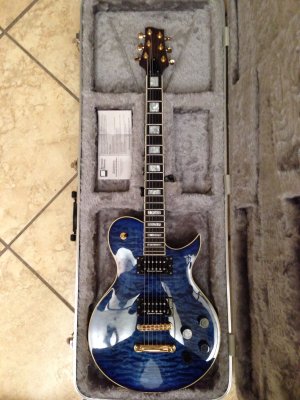
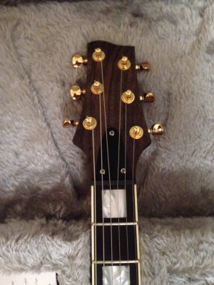
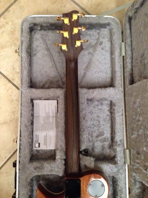
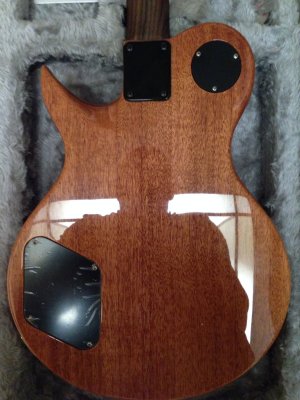
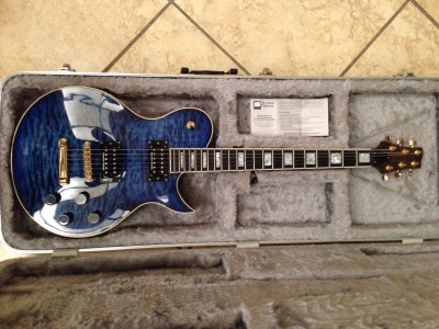
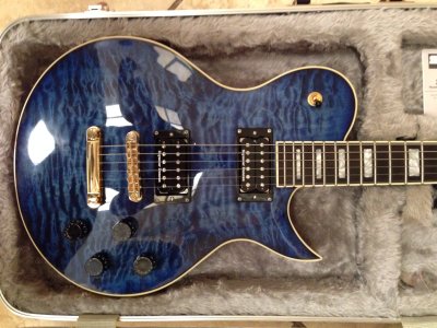
Hey folks, hopefully this isn't out of place, but since there isn't a gallery for Royales yet I figured I'd post a pic of the ole' girl right here. I started on this forum when my parts were being shipped and promised some members a completed pic...over 5 months ago and never followed up...weird how every time I had the camera and grabbed the guitar I always ended up playing it instead of taking pics lol...regardless, here she is!
 

Attachments

  • Royale.jpg
    Royale.jpg
    221.2 KB · Views: 563
So_much_win__by_Kisame_X_Mudkip.png
 
More pics!!! Clear blue dye on super high grade quilted maple top. Pics do NO justice to the shimmer inside the grain of the mahogany body when the light hits it. Thin wizard profile Rosewood neck and headstock with ebony fretboard, pearloid inlays, Seymour Duncan JB and Jazz pickups with push/push coil tapping.
 

Attachments

  • image.jpg
    image.jpg
    987.2 KB · Views: 372
  • image.jpg
    image.jpg
    867.6 KB · Views: 321
  • image.jpg
    image.jpg
    968.5 KB · Views: 301
  • image.jpg
    image.jpg
    898 KB · Views: 284
  • image.jpg
    image.jpg
    1 MB · Views: 320
  • image.jpg
    image.jpg
    944.7 KB · Views: 285
  • image.jpg
    image.jpg
    610.5 KB · Views: 292
Thanks for the kind words. I just opened all these thumbnails and saw how terrible and blurry they look full sized  :dontknow:
 
Outstanding. Blue dye and quilt is great on its own but you really did it right with this. I didn't know a Royale could look this nice. Great work. :icon_thumright:
 
Thanks! I remember being 15 and seeing an ad for a trans blue Gibson Les Paul Custom Shop Class 5 Quilt Top and knew that I had to have that guitar someday. Well I'm 29 now and with a price tag close to five grand for the Class 5, I'd say I definitely took the better deal with a completely personalized guitar with everything I wanted and nothing I didn't. Even the Royale shape is more appealing to me than a typical LP guitar and as much as I hated the plain headstock at first, I actually really like the basic, dont-take-away-from-the-wood look on the headstock of this guitar. When I began the project and told everyone I would be integrating gold and black hardware, they told me I shouldn't because "it wouldn't look right"............glad I never listened to them  :headbang1:      sounds awesome through the Marshall DSL100 half stack I just brought home too.
 
Lovely guitar, great build. This does raise one question for me though. Does it look better to have the machine heads coming out all straight on the horizontal (parallel with each other), or would it look better having them coming out 180 degrees with the curve of the headstock (if you see what I mean!). I have been fiddling with my neck and can't quite make up my mind. I will post a pic of the difference if you like.
 
Ah, the tuner-button angle conundrum.


I personally prefer the tuner spindles perpendicular to the line bisecting the neck.  Others like them perpendicular to a line tangent to the curve of the headstock edge.  Neither is "correct."  just a matter of your personal taste.


Of course, if you wanna get really crazy,you can do what the Warwick guys do with their basses and angle them so they are easier to reach while you have the guitar on a strap, although this is unlikely to result in greater utility for a guitarist.


See:
5-Headstock.jpg
 
Thanks everyone! I just went with right angles in relation to the nut when I installed the tuners. Not gonna lie...drilling holes for the tuners on a $500+ neck had me a little uneasy. I entertained the idea of angling the tuners for about 5 minutes and realized it would bug the hell out of me if they weren't all perfectly angled. My knobs are all off perfect axis in relationship to each other already so I don't think I could handle that kind of stress  :doh: :laughing11: :laughing3: :laughing7: :laughing8:
 
There does seem to be a trend these days to over-identify parts. Babicz is probably the worst, but there are too many others who want their name in lights. It's like they're forcing you to say "I spent way too much on this part, and I want you to know it!" 

Not that I don't like their products, but if I'm going to be a billboard, I want some money. Lots of it.
 
rgand said:
BranCaster said:
My knobs are all off perfect axis...
My wife says the same thing about me. :icon_biggrin:

:toothy12:  :sign13: :sign13: :sign13: :sign13: I think we're all a little off axis in many different ways lol

spauldingrules said:
Needs one thing - use some nail polish remover to take off the "Seymour Duncan" logos, and then it will be perfect.

Ya know, I love muscle cars...especially the really classy, elegant looking ones like a 67 Mercury Cougar XR-7...even though it had luxurious appointments and such, it still rocked the street/strip tires with the white wall lettering on them. I wanted to carry that idea over to the guitar: elegant and sexy but still with the white lettered Mickey Thompson slicks spinning and smoking!  :party07:
 
Gorgeous! I can't believe I'm saying this, but it needs MORE GOLD! Gold frets, gold PAFs, gold knobs... that hardware just goes perfectly with the blue dyed finish.
 
Back
Top