Leaderboard

Well, after about six months, lol...

DocNrock

Master Member
Messages
4,295
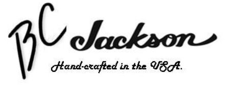
I finally figured out my graphics program and was able to make some rough-drafts for my waterslide decals for the headstocks of my guitars.  As I said before, my first initials are B.C. and my last name is Jackson.  So, since these are not going for resale, I had no qualms ripping off parts of BC Rich and Jackson trademarks. 


Let me know what you think.  Any suggestions for changes?  These are still in the computer, not yet transferred to the waterslide decals yet. 

 
Headstock goodness, nice work! I used a semi-local to make mine. He does his own version of Fender's font, and gold fills it by hand.

I think you've inspired me to try my hand at it next time, only problem is I don't have a laser printer. Although, that's an easily solved problem.
 
BigSteve22 said:
Headstock goodness, nice work! I used a semi-local to make mine. He does his own version of Fender's font, and gold fills it by hand.

I think you've inspired me to try my hand at it next time, only problem is I don't have a laser printer. Although, that's an easily solved problem.

You don't even need a laser printer.  The company that makes the waterslide decal suggests three or four coats of acrylic to seal in the ink from an inkjet printer prior to watersliding them.  I'll let you know how it works.
 
Good Idea, there. Looking forward to hearing how the inkjet works for you.
 
DocNrock said:
Bwahahaha!  Fair enough.  Is this any better?
I don't want this to seem like nitpickey jerk stuff because I think the work you do on those guitars is fantastic.  My answer is that I don't think I like the periods, or at least where they are located.  However, I have no idea if it would look any better without.  I'm terrible with graphic art issues.  I can't see things like that in my head.  I have to see the result.
 
jmcecil said:
DocNrock said:
Bwahahaha!  Fair enough.  Is this any better?
I don't want this to seem like nitpickey jerk stuff because I think the work you do on those guitars is fantastic.  My answer is that I don't think I like the periods, or at least where they are located.  However, I have no idea if it would look any better without.  I'm terrible with graphic art issues.  I can't see things like that in my head.  I have to see the result.

No worries, man.  I appreciate the candor.  The periods are exactly where they are in the B.C. Rich logo.
 
DocNrock said:
jmcecil said:
DocNrock said:
Bwahahaha!  Fair enough.  Is this any better?
I don't want this to seem like nitpickey jerk stuff because I think the work you do on those guitars is fantastic.  My answer is that I don't think I like the periods, or at least where they are located.  However, I have no idea if it would look any better without.  I'm terrible with graphic art issues.  I can't see things like that in my head.  I have to see the result.

No worries, man.  I appreciate the candor.  The periods are exactly where they are in the B.C. Rich logo.
What if you just borrowed the BC without the periods? They may be the way BC Rich has it, but that doesn't necessarily mean they have to be on there.
 

Attachments

  • BCJackson.jpg
    BCJackson.jpg
    48.3 KB · Views: 365
rgand said:
DocNrock said:
jmcecil said:
DocNrock said:
Bwahahaha!  Fair enough.  Is this any better?
I don't want this to seem like nitpickey jerk stuff because I think the work you do on those guitars is fantastic.  My answer is that I don't think I like the periods, or at least where they are located.  However, I have no idea if it would look any better without.  I'm terrible with graphic art issues.  I can't see things like that in my head.  I have to see the result.

No worries, man.  I appreciate the candor.  The periods are exactly where they are in the B.C. Rich logo.
What if you just borrowed the BC without the periods? They may be the way BC Rich has it, but that doesn't necessarily mean they have to be on there.

That is indeed a cool thought...
 
Cagey said:
I prefer the period-free version, too.

OK, I guess the period-free version wins.  Nothing wrong with post-menopausal...after all, BC Rich and Jackson both probably are!  :laughing7:
 
Hehe! Well, Jackson's only 35-ish, so a bit young yet. BC Rich is 46, though. Probably right at the point where the "Bitch" name is appropriate  :laughing7:

imgrc0070083114.jpg


BC Rich Bitch - needs a Floyd... and more knobs/switches
 
Honestly not a fan of this. I would say do the entire thing in one font or the other. Even then, eh. Using the exact fonts from those companies to me implies that it's some sort of Frankenstein of guitars from both manufacturers, which it clearly is not.

Maybe go to a local tattoo artist and see if they could draw something up for you?
 
Jesse said:
Honestly not a fan of this. I would say do the entire thing in one font or the other. Even then, eh. Using the exact fonts from those companies to me implies that it's some sort of Frankenstein of guitars from both manufacturers, which it clearly is not.

Maybe go to a local tattoo artist and see if they could draw something up for you?

Point taken, Jesse.  If I built these for sale, there is no way I would have done a logo like this.  But these are my personal collection, and I happen to love BC Rich and Jackson guitars.  And the initials fit mine.  I'll play around a bit and see what else I can come up with.  But honestly, when the idea first came to mind, I loved it!
 
Back
Top