You are using an out of date browser. It may not display this or other websites correctly.
You should upgrade or use an alternative browser.
You should upgrade or use an alternative browser.
Custom Neck Plates
- Thread starter simple
- Start date
dudesweet157
Hero Member
- Messages
- 661
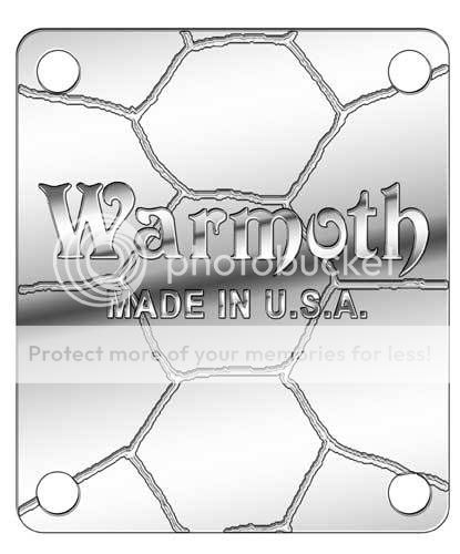
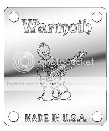
I like the second one, it makes more sense than the first.
I was oblivious to the fact that the Warmoth mascot was a turtle until I found the decal in the box with my neck. It also sorta looks like someone took an icepick to the first one; are the grooves smooth or sharp rather? I definitely WOULD NOT want one with sharp grooves.
I was oblivious to the fact that the Warmoth mascot was a turtle until I found the decal in the box with my neck. It also sorta looks like someone took an icepick to the first one; are the grooves smooth or sharp rather? I definitely WOULD NOT want one with sharp grooves.
The first one would be nicely engraved. (That's a turtle shell pattern in case it didn't make sense). :icon_thumright:dudesweet157 said:I like the second one, it makes more sense than the first.
I was oblivious to the fact that the Warmoth mascot was a turtle until I found the decal in the box with my neck. It also sorta looks like someone took an icepick to the first one; are the grooves smooth or sharp rather? I definitely WOULD NOT want one with sharp grooves.
TroubledTreble
Hero Member
- Messages
- 830
Ahh yes! I like the second one best. The made in U.S.A. is wonderful. I wouldn't offer the first one but one that just said "Warmoth" would be good offering. In fact the first one with a random number would be fantastic! (no shell pattern)
Perhaps you could add one more to the category for voting. "Warmoth, Made in U.S.A, random ##"
-TT-
Perhaps you could add one more to the category for voting. "Warmoth, Made in U.S.A, random ##"
-TT-
Call me crazy, I like the first one a lot. LOVE the random serial # idea.
I know this'll draw fire, but I've never been fond of the warmoth turtle. Don't get me wrong, turtles are the s***. But the warmoth turtle as is seems kinda silly looking to me - he doesn't do justice to the awesomeness that is turtledom.
Sorry guys.
(Regardless of what design might be chosen, I definitely want one of these things)
u9
Junior Member
- Messages
- 37
^ ditto ^
The shell one is ok but you'd have to know that Warmoth's mascot if a turtle to get it, else it would just look wierd. The second idea is better. I like the turtle (and turtles in general) but I agree with the earlier post about it looking rather silly for certain guitars.
The shell one is ok but you'd have to know that Warmoth's mascot if a turtle to get it, else it would just look wierd. The second idea is better. I like the turtle (and turtles in general) but I agree with the earlier post about it looking rather silly for certain guitars.
Superbeast520
Hero Member
- Messages
- 617
I like the first Shell plate, but without the shell pattern, being into pretty plain but quality designs, I dig the Warmoth name and design of the letters,especially how the m and h in Warmoth come to a sharp point, that and the Fat looking W make it a pretty tough looking name, I also like how the made in the U.S.A. is right below it in the first design, but I have to agree the shell pattern should be an option, as alot of us are older guys or just like plainer designs, as it looks classier, from a less is more = Quality stand point.
Why exactly is the Turtle the Warmoth symbol???? If theres a story to it, maybe it should be mentioned somewhere on the front page of the home page?????
Im not much for Headstock art, though the new Gold and metal letters looks pretty sharp, especially on a gib style or Warmoth headstock where they can be placed in the middle like Greg has on his No. 1, that looks great, a strat though, is hard to place being that it has a non uniform head shape, but I wouldn't mind a simple neck plate design; that would be something I would use.
I think serial numbers would be cool, maybe even a series no. for particular body models????, kind of a novel Warmoth owners club kinda thing, where a Warmoth guy would know its a plate for a strat or a V.I.P., or a LP but that would be more involved obviously, and be more work for someone in the shop, ( As if you guy's don't have enough to do ! ) hahahahaahahha..........just thoughts........ :laughing7:
I like U9's jackson plate Idea, maybe put a full turtle shell viewed from the Top as the texture inside the border, then with the Warmoth , made in U.S.A. like the first shell plate words are placed,superimposed over the top of the shell, and then a serial no. centered a few spaces down from the Made in U.S.A.????
How about a basic plate that simply has the cool font Warmoth logo, no Turtle, and Made in the U.S.A.? Dignified, yet cool. Similar to some Fender neck plates of the past (my early American Standard neck plate is simply Fender diagonally stamped). I like the idea of random numbering the neck plates, but what about an upcharge for a serial number of the customer's choosing?
That would mean we'd have to engrave. Not sure if want to get into metal working.I like the idea of random numbering the neck plates, but what about an upcharge for a serial number of the customer's choosing?
Superbeast520
Hero Member
- Messages
- 617
Yeah, I want 666...................... :evil4:  arty07: :evil4: hahahaahahaahahhaaha.......
Nando Vallart
Epic Member
- Messages
- 8,256
I like that! 
givememytoys
Senior Member
- Messages
- 230
id really like the first one without the tortious pattern in it . just a great big warmoth with a little { made in usa } it would be classy at least i think so
j_fountain2
Newbie
- Messages
- 18
Gregg Stewart said:Also, if you would like to design a super cool neck plate for Warmoth, we'd love to see more ideas! :icon_thumright:
Okay here's my idea.... if I can get it to post this time.
[attachment deleted by admin]
Similar threads
- Replies
- 22
- Views
- 1K
- Replies
- 14
- Views
- 723
- Replies
- 2
- Views
- 112


