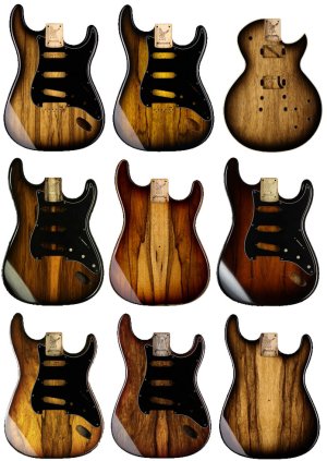
Bear in mind that the colour of the wood underneath will be slightly different too. And the thickness the finish is sprayed at and whether it's the first in a batch, in the middle, or at the end will all affect the intensity of the colour. Not different enough to cause huge variations, but there's always going to be minor shifts.
I've never found any Warmoth-finished piece I've handled—be it a full paint job, dye job, tint, or whatever—has ever matched the website's representations or the showcase photos. As a photographer myself, I can't help but notice that everything I've seen come out of the showcase has the same shift in hue and contrast, consistently, which is a classic sign of photos being edited with uncalibrated profiles on uncalibrated monitors.
Trust in fellow customers when they say that tints have changed and that any tinted neck you get now will have a less vivid tint than previous ones. And no, don't trust in Warmoth's photos, at least as far as hue and saturation are concerned.


") Unfortunately, no matter how well they do their job, once those images leave their carefully calibrated monitors, it's a crap shoot. Every customer sees showcase images based on the screen settings of their own particular device. As all you graphic designers and photographers will attest, anybody that thinks it's a slam-dunk to make images look the same across every device has never tried it. It's a Kobayashi Maru of epic proportions.
Unfortunately, no matter how well they do their job, once those images leave their carefully calibrated monitors, it's a crap shoot. Every customer sees showcase images based on the screen settings of their own particular device. As all you graphic designers and photographers will attest, anybody that thinks it's a slam-dunk to make images look the same across every device has never tried it. It's a Kobayashi Maru of epic proportions.