Build Planning - FireCaster Logo

Brak

Newbie
Messages
6
I'm planning a build that is a Gibson scale neck with a Jazzcaster body, Broadcaster and Firebird pickups, Jazzmaster trem, etc...a Firecaster. The most important part of planning - obviously - is the waterslide decal logos (but seriously, this does help keep me motivated). Since the Firebird always had this cool logo of the bird on the pickguard, I figured I'd try to come up with a Firecaster version. The original Firebird is on the left, my Firecaster is on the right, feedback welcomed.
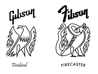
FireCaster.jpg
 
I like your design overall, though the F font seems to clash with the other font to my eye.
 
Very cool. Do you have experience with graphic design? The proportionality on your version is very good. Nothing really off balance. Good job for real.
 
I like your design overall, though the F font seems to clash with the other font to my eye.
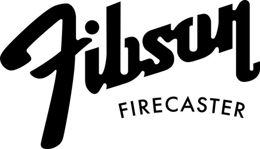
Hi @stratamania - Thanks! The F font clashing is intentional - it is the Fender "F", with a Gibson "ibson" to make a Fibson. Being a not-real version of either guitar, "Fib" gets that point across with a bit of cheek and sounds better than a Gender or Gibder or Fendson. I also toyed with having the baseline of the F lower so it matches the layout of the Fender logo more closely, maybe that makes the F clash a little less?
Fibson_Guitar_logoLo.jpg
Very cool. Do you have experience with graphic design? The proportionality on your version is very good. Nothing really off balance. Good job for real.
@bruzanhd - Thanks a lot, yeah, I'm a digital marketer and graphic artist by trade.
 
This looks great, really nicely done. For what it's worth, I like your new version (post #4) even better than your original layout. Dropping the F down lines it up really nicely with the n in Gibson, too. What do you think about shifting Firecaster to the left, more centered with Fibson, situated along the diagonal from the bottoms of the F and n of Fibson?
 
This looks great, really nicely done. For what it's worth, I like your new version (post #4) even better than your original layout. Dropping the F down lines it up really nicely with the n in Gibson, too. What do you think about shifting Firecaster to the left, more centered with Fibson, situated along the diagonal from the bottoms of the F and n of Fibson?
Good feedback, the more I see it, the more I like it with the F lower too. As for the Firecaster word, the way that lays out will depend on the headstock I choose - the only thing actually going on the pickguard is the Firecaster/Dragon dude.

Right now, the neck/headstock is a tossup between the hombre (traditional Gibson 3x3) and the Warhead (as close as Warmoth has to a Firebird). I suppose the 3rd choice is a tele headstock to go with the tele body bits, but since I'm going with the Gibson scale length neck, I'd like the headstock to reflect that.

If I go with the hombre, the "Fibson" would go at the top where Gibson goes and "Firecaster" would run up the middle where Les Paul usually is. If I go with the Warhead, then it depends on whether I go full reverse like the original FB or what. That one seems more complicated, because I'd also be tempted to go with the Steinberger gearless tuners. So I'm leaning toward the hombre for the sake of simplicity, but in the end the Warhead FB style would be more interesting and unique.
 
@Brak yes I recognize the fonts and guessed that was the intent. The example with the baseline of the F lower and also, it moves right side of the crossbar of the F if I recall the correct typographical term in between the stem and dot of the i which altogether looks much better to me.

And of course welcome to the forum.
Thanks! And thanks!
 
Hey ... how would it look if you used an F in the same font as the rest of the ibson?
 
Hey ... how would it look if you used an F in the same font as the rest of the ibson?
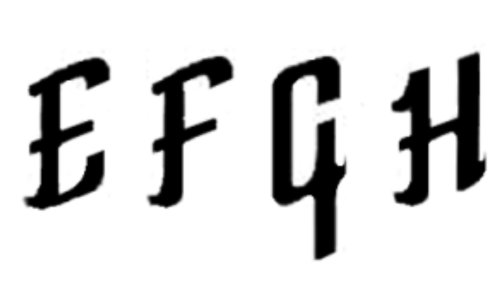
Hmm, well, someone out there did set up a font that mimics the Gibson logo and they are charging 30 bucks. Too much $ for an F IMHO (probably some sex worker jokes in there). I could likely just draw one like this myself so the logo was more consistent, but doesn't that defeat the purpose of it representing a Fender/Gibson combo?
Screenshot_20230303_141641_Chrome.jpg
 
Hey ... how would it look if you used an F in the same font as the rest of the ibson?
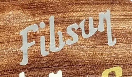
Further proof that if we can think of something, it's likely already been thought. Here's Fibson with the Gibson F (guy selling decals on ETSY):
Screenshot_20230304_084320_Chrome.jpg
Certainly looks more like a proper logo, a bit too proper, and not what I have in mind 😉
 
I agree, I prefer the Fender F contrasting with the rest of the Gibson type. The Fender F is iconic and immediately recognizable, and blending it with the Gibson type makes the joke that much better.
 
Back
Top