

bagman67
Epic Member
- Messages
- 9,237
Hey all, it's me, the guy with the poplar Velocity body purchased on impulse a while back. My goal is to preserve the contrast between the pale blaze up the middle and the greenish wings of the body, but I'm not entirely nuts about just clearcoating it. So I got a little plank of poplar with similar contrast between green and white and I've been experimenting.
I welcome your thoughts and opinions on the experiments I've done here.
First, here's the body:
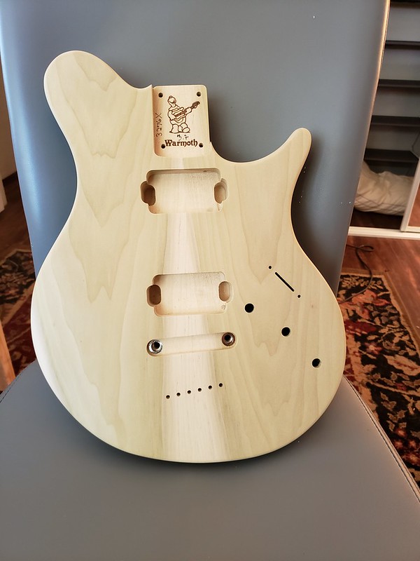
Lovely, innit? But the contrast between the green and the white is not that strong. Luckily, poplar project lumber is cheap. Here's what I did:
I masked off segments of the board and experimented with different stains and toners.
Here, from top to bottom, I used Behlen Solar Lux blood red, yellow-orange, and lemon yellow, and then at the bottom is a toner I mixed out of clear lacquer and yellow Mixol pigment with a little red. I then sprayed the edge with a Behlen medium brown instrument toner to get an idea what I might get if I do a tobacco burst.
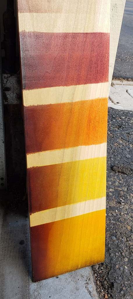
Clearly, the blood red stain completely masks the contrast, and the yellow-orange is not much better. Further, the red hardly contrasts with the brown burst edge, so that's completely out. Lemon yellow, however, has some potential.
In my view, my own homemade toner comes in second behind the lemon yellow stain on this first side of the test board. I like how the burst shows a little more red on my toner than on the lemon yellow, but the lemon yellow shows the white and green contrast better. And for the sharp-eyed among you: that black spatter on the bottom of my toner was me attempting to see how a black burst edge might look, but I used an ancient can of black lacquer that I should have shot at something else first to test whether it had gone bad. Live and learn, amirite?
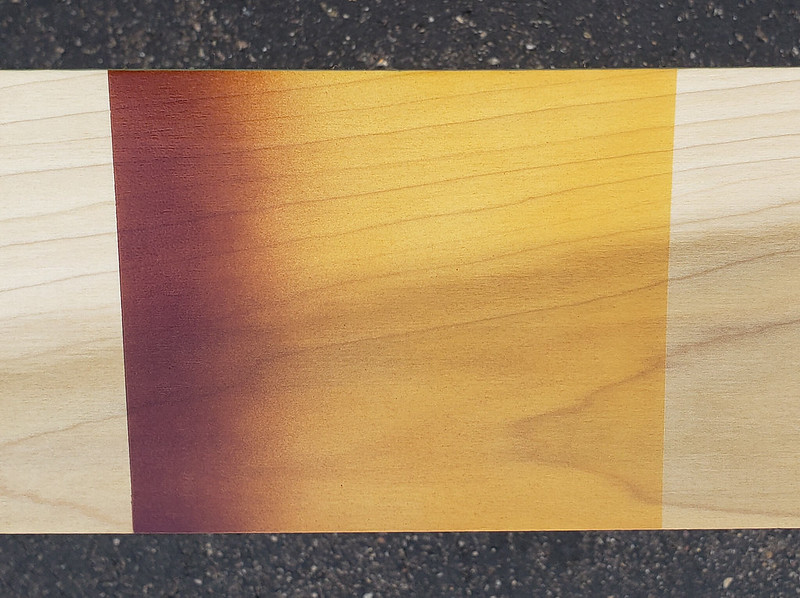
On the reverse I tried this Mohawk amber toner but w I think it looks a little more cloudy than I'd like. If I were after a butterscotch finish over ash, I'd go nuts with this stuff, but it doesn't show the grain as much as I'd like in this context.
I welcome your thoughts and opinions on the experiments I've done here.
First, here's the body:
Lovely, innit? But the contrast between the green and the white is not that strong. Luckily, poplar project lumber is cheap. Here's what I did:
I masked off segments of the board and experimented with different stains and toners.
Here, from top to bottom, I used Behlen Solar Lux blood red, yellow-orange, and lemon yellow, and then at the bottom is a toner I mixed out of clear lacquer and yellow Mixol pigment with a little red. I then sprayed the edge with a Behlen medium brown instrument toner to get an idea what I might get if I do a tobacco burst.
Clearly, the blood red stain completely masks the contrast, and the yellow-orange is not much better. Further, the red hardly contrasts with the brown burst edge, so that's completely out. Lemon yellow, however, has some potential.
In my view, my own homemade toner comes in second behind the lemon yellow stain on this first side of the test board. I like how the burst shows a little more red on my toner than on the lemon yellow, but the lemon yellow shows the white and green contrast better. And for the sharp-eyed among you: that black spatter on the bottom of my toner was me attempting to see how a black burst edge might look, but I used an ancient can of black lacquer that I should have shot at something else first to test whether it had gone bad. Live and learn, amirite?
On the reverse I tried this Mohawk amber toner but w I think it looks a little more cloudy than I'd like. If I were after a butterscotch finish over ash, I'd go nuts with this stuff, but it doesn't show the grain as much as I'd like in this context.

